I mentioned in my blog post HERE that I submitted an article for a magazine at the request of the editor. Since it apparently didn't get used, I thought I would share it with you guys. No sense in perfectly good set of tips going to waste.
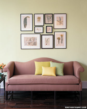
So, without further ado, here are my tips for CREATING A SOFT COLOR SCHEME.
1. Select a soft hued wall color that appeals to you and that evokes the mood you’d like to create (i.e. serene, coastal, airy, etc). Don’t be bound by color trends. What’s “in” today may very well be out tomorrow, so select a color that you absolutely love.
2. Get inspired. Choose an inspiration piece as a starting point. A vintage quilt, art work, a fun fabric; these will provide direction and can help dictate the color scheme for the entire space.
3. Don’t be afraid to mix patterns. Using patterns is a great way to add visual interest, and it’s easier than you may think. Patterns don’t need to “match”, just be sure that each relates to one another. You can achieve this by selecting textiles with similar color tones.
4. Give the eye a place to rest. Add in solid neutrals like white or cream in furniture pieces, bedding or rugs to keep the space from becoming too busy.
5. Layer in accessories. Incorporate accessories in similar tones to achieve a personalized collected over time look.
6. Make it work. Find something you love, but the color isn’t quite right? Remember, thrift store, garage sale and Craigslist finds can easily be repainted, reupholstered or repurposed to work in your space.
7. Capitalize on form and function. Incorporate items that you already own or use daily that work with your palette as decorative accessories. Buttons, thread, jewelry, dishware; can all make fabulous, functional and frugal accessories.
So, there you have it, the magazine article that almost was. Happy Monday!