


I get inspiration from all sorts of places, but there is something so appealing about well-designed and photographed pages that just lure me in. I can literally spend hours flipping through the pages of design magazines and apps like Houzz, looking at the beautiful spaces. I have a really hard time getting rid of the paper catalogs sometimes because it seems as if every time I look through them I see something new. Such was the case with the Spring Williams-Sonoma Home catalog. I've looked at it at least a dozen times and I'm obsessed with the products and spaces.

For example, I could seriously jump into any of these pages and live happily ever after.
 |
| Williams-Sonoma Home |

Williams-Sonoma Home

Williams-Sonoma Home
When I peruse design magazines and catalogs, I'm always looking for things I can duplicate on a budget. Here are a few things that caught my eye in this space.
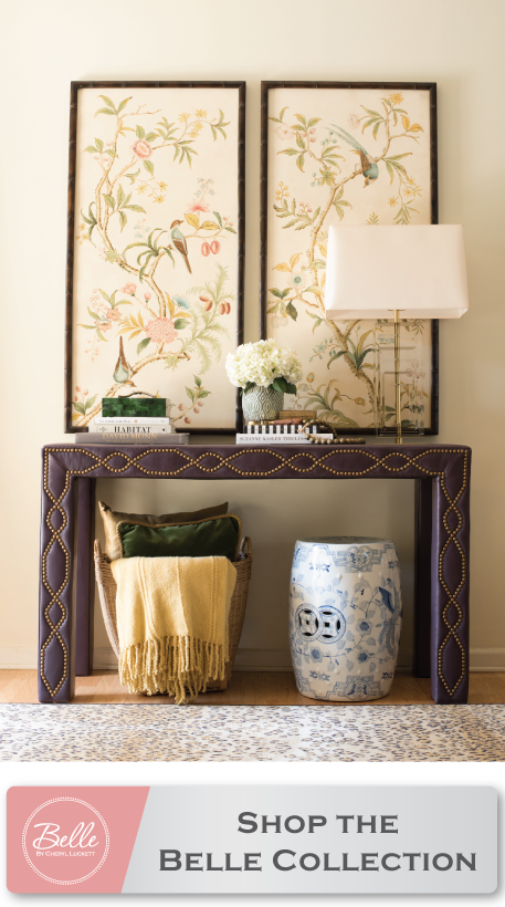
1. The ceramic garden stool. I love it as a side table. I picked up the one I have on a sidewalk sale at Kirkland's last fall. It was leftover from Spring/Summer and at $20, I'm kicking myself for not buying multiples.
2. I love the HUGE Fiddle Leaf fig. I blogged about them HERE.
3. Do I even need to note how much I love the clean lines of the sofa above? It almost makes me wish I'd gone tufted on my recent sofa makeover.
4. The flood light rocks. It definitely puts me in mind of the pharmacy lamp I recently added to my living room.
5. I always keep my eyes open for small metal tables when I'm out thrifting. So cute and functional.

In this space, I love the neutral color palette. I'm actually pulling something together for a current client that's very similar. However, a closer look reveals a few other things beyond the color.
1. It dawned on me that the shades on the lovely glass lamps aren't drum shades. Is the trend changing? Hmmm...
2. I love that the magazines are just stacked neatly in a simple tray/basket. This is a perfect solution for those of us who have tons of them.
3. The large mirror looks casual yet dramatic leaning against the wall with art layered in front of it.

Lastly, the color scheme in this space is my favorite, but I also noticed a couple other of things.
1. The vignette on top of the secretary is so well put together. I study things like that in photos. I love the three different decorative items grouped together and again how the art is simply leaning instead of hung.
2. Because I'm a thrifter at heart, I couldn't help but notice the simple (almost country) chair featured in the photo. There's nothing extra special about it, but it looks so graceful in the environment that it's in. How many times have I passed a similar chair on one of my thrift outings?
The bottom line is that you may need to give those catalogs and magazines a second (third, and fourth) look. Remember, the (design) eye is a muscle; The more you use it, the stronger it gets.
Have you subscribed to the Dwell by Cheryl blog?

1 Comments - Click here to join the conversation!:
Wow great thoughts you gave there. I am so much thankful to you.
Indoor Floral Lily Taupe Area Rug
Post a Comment